Insert charts
Insert a chart
To insert a chart into the speadsheet,
-
Select the cell range that contain the data you wish to use for the chart.
-
Switch to the Insert tab of the top toolbar.
-
Click the
 Chart icon on the top toolbar.
 -
Select a chart Type you wish to insert: Column, Line, Pie, Bar, Area, XY (Scatter), or Stock.
Note: For Column, Line, Pie, or Bar charts, a 3D format is also available.
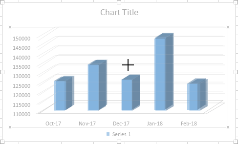
After that the chart will be added to the worksheet.
Adjust the chart settings
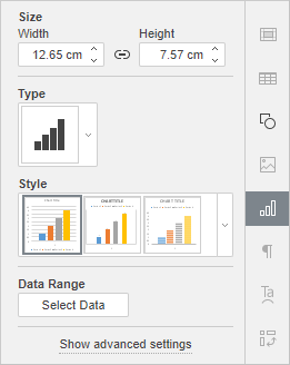
Now you can change the settings of the inserted chart. To change the chart type:
-
Select the chart with the mouse.
-
Click the Chart settings
 icon on the right sidebar.
-
Open the Type drop-down list and select the type you need.
-
Open the Style drop-down list below and select the style which suits you best.
The selected chart type and style will be changed.
To edit chart data:
-
Click the Select Data button on the right-side panel.
-
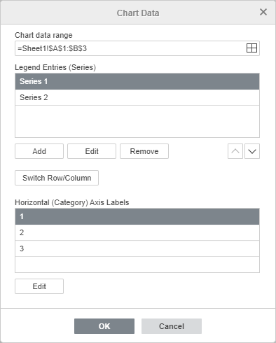
Use the Chart Data dialog to manage Chart Data Range, Legend Entries (Series), Horizontal (Category) Axis Label and Switch Row/Column.
-
Chart Data Range: select data for your chart.
-
Click the
 icon on the right of the Chart data range box to select data range.
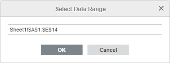
-
-
Legend Entries (Series): add, edit, or remove legend entries. Type or select series name for legend entries.
-
In Legend Entries (Series) , click Add button.
-
In Edit Series , type a new legend entry or click the
icon on the right of the Select name box.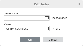
-
-
Horizontal (Category) Axis Labels: change text for category labels.
-
In Horizontal (Category) Axis Labels , click Edit.
-
In Axis label range , type the labels you want to add or click the
icon on the right of the Axis label range box to select data range.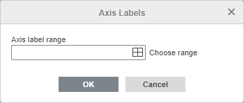
-
-
Switch Row/Column: rearrange the worksheet data that is configured in the chart not in the way that you want it. Switch rows to columns to display data on a different axis.
-
Click OK button to apply the changes and close the window.
Click Show Advanced Settings to change other settings such as Layout , Vertical Axis , Horizontal Axis , Cell Snapping and Alternative Text .
The Layout tab allows you to change the layout of chart elements.
-
Specify the Chart Title position in regard to your chart by selecting the necessary option from the drop-down list:
-
None to not display a chart title,
-
Overlay to overlay and center the title in the plot area,
-
No Overlay to display the title above the plot area.
-
-
Specify the Legend position in regard to your chart by selecting the necessary option from the drop-down list:
-
None to not display the legend,
-
Bottom to display the legend and align it to the bottom of the plot area,
-
Top to display the legend and align it to the top of the plot area,
-
Right to display the legend and align it to the right of the plot area,
-
Left to display the legend and align it to the left of the plot area,
-
Left Overlay to overlay and center the legend to the left in the plot area,
-
Right Overlay to overlay and center the legend to the right in the plot area.
-
-
Specify the Data Labels (i.e. text labels that represent exact values of data points) parameters:
-
specify the Data Labels position relative to the data points by selecting the necessary option from the drop-down list. The available options vary depending on the selected chart type.
-
For Column/Bar charts, you can choose the following options: None, Center, Inner Bottom, Inner Top, Outer Top.
-
For Line/XY (Scatter)/Stock charts, you can choose the following options: None, Center, Left, Right, Top, Bottom.
-
For Pie charts, you can choose the following options: None, Center, Fit to Width, Inner Top, Outer Top.
-
For Area charts as well as for 3D Column, Line and Bar charts, you can choose the following options: None, Center.
-
-
select the data you wish to include into your labels checking the corresponding boxes: Series Name, Category Name, Value,
-
enter a character (comma, semicolon etc.) you wish to use for separating several labels into the Data Labels Separator entry field.
-
-
Lines: is used to choose a line style for Line/XY (Scatter) charts. You can choose one of the following options: Straight to use straight lines between data points, Smooth to use smooth curves between data points, or None to not display lines.
-
Markers: is used to specify whether the markers should be displayed (if the box is checked) or not (if the box is unchecked) for Line/XY (Scatter) charts.
Note: The Lines and Markers options are available for Line charts and XY (Scatter) charts only.
-
The Axis Settings section allows you to specify if you wish to display the Horizontal/Vertical Axis or not by selecting the Show or Hide option from the drop-down list. You can also specify Horizontal/Vertical Axis Title parameters:
-
Specify if you wish to display the Horizontal Axis Title or not by selecting the necessary option from the drop-down list:
-
None to not display the horizontal axis title,
-
No Overlay to display the title below the horizontal axis.
-
-
Specify the orientation of the Vertical Axis Title by selecting the necessary option from the drop-down list:
-
None to not display the vertical axis title,
-
Rotated to display the title from bottom to top to the left of the vertical axis,
-
Horizontal to display the title horizontally to the left of the vertical axis.
-
-
-
The Gridlines section allows you to specify which of the Horizontal/Vertical Gridlines you wish to display selecting the necessary option from the drop-down list: Major,Minor , or Major and Minor . You can hide the gridlines at all using the None option.
Note: The Axis Settings and Gridlines sections will be disabled for Pie charts since charts of this type have no axes and gridlines.
Note: The Vertical/Horizontal Axis tabs will be disabled for Pie charts since charts of this type have no axes.
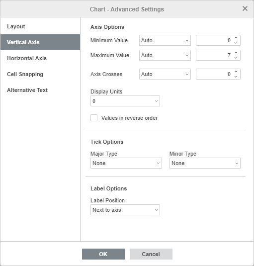
The Vertical Axis tab allows you to change the parameters of the vertical axis (also referred to as the values axis or y-axis) which displays numeric values. Note that the vertical axis will be the category axis which displays text labels for the Bar charts , therefore in this case the Vertical Axis tab options will correspond to the ones described in the next section. For the XY (Scatter) charts, both axes are value axes.
-
The Axis Options section allows you to set the following parameters:
-
Minimum Value: is used to specify the lowest value displayed at the beginning of the vertical axis. The Auto option is selected by default, in this case the minimum value is calculated automatically depending on the selected data range. You can select the Fixed option from the drop-down list and specify a different value in the entry field on the right.
-
Maximum Value: is used to specify the highest value displayed at the end of the vertical axis. The Auto option is selected by default, in this case the maximum value is calculated automatically depending on the selected data range. You can select the Fixed option from the drop-down list and specify a different value in the entry field on the right.
-
Axis Crosses: is used to specify a point on the vertical axis where the horizontal axis should cross it. The Auto option is selected by default, in this case the axes intersection point value is calculated automatically depending on the selected data range. You can select the Value option from the drop-down list and specify a different value in the entry field on the right, or set the axes intersection point at the Minimum/Maximum Value on the vertical axis.
-
Display Units: is used to determine a representation of the numeric values along the vertical axis. This option can be useful if you're working with great numbers and wish the values on the axis to be displayed in a more compact and readable way (e.g. you can represent 50 000 as 50 by using the Thousands display units). Select the desired units from the drop-down list: Hundreds, Thousands, 10 000, 100 000, Millions, 10 000 000, 100 000 000, Billions, Trillions, or choose the None option to return to the default units.
-
Values in reverse order: is used to display values in an opposite direction. When the box is unchecked, the lowest value is at the bottom and the highest value is at the top of the axis. When the box is checked, the values are ordered from top to bottom.
-
-
The Check Options section allows to adjust the appearance of tick marks on the vertical scale. Major tick marks are the larger scale divisions which can have labels displaying numeric values. Minor tick marks are the scale subdivisions which are placed between the major tick marks and have no labels. tick marks also define where gridlines can be displayed, if the corresponding option is set at the Layout tab. The Major/Minor Type drop-down lists contain the following placement options:
-
None to not display major/minor tick marks,
-
Cross to display major/minor tick marks on both sides of the axis,
-
In to display major/minor tick marks inside the axis,
-
Out to display major/minor tick marks outside the axis.
-
-
The Label Options section allows to adjust the appearance of major tick mark labels which display values. To specify a Label Position in regard to the vertical axis, select the necessary option from the drop-down list:
-
None to not display tick mark labels,
-
Low to display tick mark labels to the left of the plot area,
-
High to display tick mark labels to the right of the plot area,
-
Next to axis to display tick mark labels next to the axis.
-
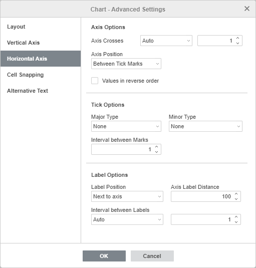
The Horizontal Axis tab allows you to change the parameters of the horizontal axis also referred to as the categories axis or x-axis which displays text labels. Note that the horizontal axis will be the value axis which displays numeric values for the Bar charts, therefore in this case the Horizontal Axis tab options will correspond to the ones described in the previous section. For the XY (Scatter) charts, both axes are value axes.
-
The Axis Options section allows you to set the following parameters:
-
Axis Crosses: is used to specify a point on the horizontal axis where the vertical axis should cross it. The Auto option is selected by default, in this case the axes intersection point value is calculated automatically depending on the selected data range. You can select the Value option from the drop-down list and specify a different value in the entry field on the right, or set the axes intersection point at the Minimum/Maximum Value (that corresponds to the first and last category) on the horizontal axis.
-
Axis Position: is used to specify where the axis text labels should be placed: On Tick Marks or Between tick Marks.
-
Values in reverse order: is used to display categories in an opposite direction. When the box is unchecked, categories are displayed from left to right. When the box is checked, the categories are ordered from right to left.
-
-
The Check Options section allows to adjust the appearance of tick marks on the horizontal scale. Major tick marks are the larger divisions which can have labels displaying category values. Minor tick marks are the smaller divisions which are placed between the major tick marks and have no labels. Tick marks also define where gridlines can be displayed, if the corresponding option is set on the Layout tab. You can adjust the following tick mark parameters:
-
Major/Minor Type: is used to specify the following placement options: None to not display major/minor tick marks, Cross to display major/minor tick marks on both sides of the axis, In to display major/minor tick marks inside the axis, Out to display major/minor tick marks outside the axis.
-
Interval between Marks: is used to specify how many categories should be displayed between two adjacent tick marks.
-
-
The Label Options section allows you to adjust the appearance of labels which display categories.
-
Label Position: is used to specify where the labels should be placed in regard to the horizontal axis. Select the necessary option from the drop-down list: None to not display category labels, Low to display category labels at the bottom of the plot area, High to display category labels at the top of the plot area, Next to axis to display category labels next to the axis.
-
Axis Label Distance: is used to specify how closely the labels should be placed to the axis. You can specify the necessary value in the entry field. The more the value you set, the more the distance between the axis and labels is.
-
Interval between Labels: is used to specify how often the labels should be displayed. The Auto option is selected by default, in this case labels are displayed for every category. You can select the Manual option from the drop-down list and specify the necessary value in the entry field on the right. For example, enter 2 to display labels for every other category etc.
-
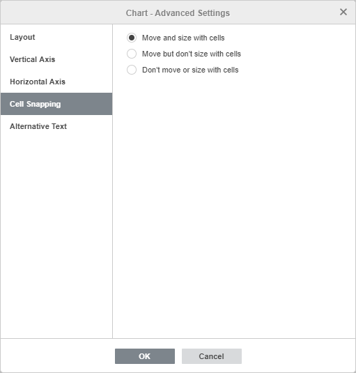
The Cell Snapping tab contains the following parameters:
-
Move and size with cells: this option allows you to snap the chart to the cell behind it. If the cell moves (e.g. if you insert or delete some rows/columns), the chart will be moved together with the cell. If you increase or decrease the width or height of the cell, the chart will change its size as well.
-
Move but don't size with cells: this option allows to snap the chart to the cell behind it preventing the chart from being resized. If the cell moves, the chart will be moved together with the cell, but if you change the cell size, the chart dimensions remain unchanged.
-
Don't move or size with cells: this option allows to prevent the chart from being moved or resized if the cell position or size was changed.
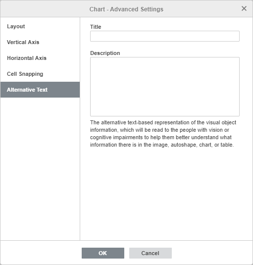
The Alternative Text tab allows to specify the Title and the Description which will be read to people with vision or cognitive impairments to help them better understand what information the chart contains
Edit chart elements
To edit the chart Title , select the default text with the mouse and type in your own one instead.
To change the font formatting within text elements, such as the chart title, axes titles, legend entries, data labels etc., select the necessary text element by left-clicking it. Then use icons on the Home tab of the top toolbar to change the font type, style, size, or color.
When the chart is selected, the Shape settings icon is also available on the right, since the shape is used as a background for the chart. You can click this icon to open the Shape Settings tab on the right sidebar and adjust the shape Fill and Stroke . Note that you cannot change the shape type.
Using the Shape Settings tab on the right panel you can not only adjust the chart area itself, but also change the chart elements, such as the plot area , data series , chart title , legend , etc. and apply different fill types to them. Select the chart element by clicking it with the left mouse button and choose the preferred fill type: solid color , gradient , texture or picture , pattern . Specify the fill parameters and set the Opacity level if necessary. When you select a vertical or horizontal axis or gridlines, the stroke settings are only available on the Shape Settings tab: color, width and type. For more details on how to work with shape colors, fills and stroke, please refer to this page.
Note: The Show shadow option is also available on the Shape settings tab, but it is disabled for chart elements.
If you need to resize chart elements, left-click to select the needed element and drag one of 8 white squares located along the perimeter of the element.
To change the position of the element, left-click on it, make sure your cursor changed to , hold the left mouse button and drag the element to the needed position.
To delete a chart element, select it by left-clicking and press the Delete key on the keyboard.
You can also rotate 3D charts using the mouse. Left-click within the plot area and hold the mouse button. Drag the cursor without releasing the mouse button to change the 3D chart orientation.
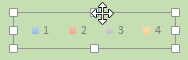
If necessary, you can change the chart size and position.
To delete the inserted chart, click it and press the Delete key.
Edit sparklines
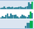
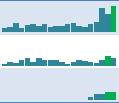
Sparkline is a little chart that fits in one cell. Sparklines can be useful if you want to visually represent information for each row or column in large data sets. This makes it easier to show trends in multiple data series.
If your spreadsheet already contains sparklines created with another application, you can change the sparkline properties. To do that, select the cell that contains a sparkline with the mouse and click the Chart settings icon on the right sidebar. If the selected sparkline is included into a sparkline group, the changes will be applied to all sparklines in the group.
-
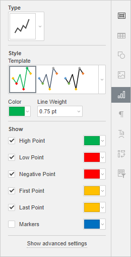
Use the Type drop-down list to select one of the available sparkline types:
-
Column: this type is similar to a regular Column Chart.
-
Line: this type is similar to a regular Line Chart.
-
Win/Loss: this type is suitable for representing data that include both positive and negative values.
-
-
In the Style section, you can do the following:
-
select the style which suits you best from the Template drop-down list.
-
choose the necessary Color for the sparkline.
-
choose the necessary Line Weight (available for the Line type only).
-
-
The Show section allows you to select which sparkline elements you want to highlight to make them clearly visible. Check the box to the left of the element to be highlighted and select the necessary color by clicking the colored box:
-
High Point: to highlight points that represent maximum values,
-
Low Point: to highlight points that represent minimum values,
-
Negative Point: to highlight points that represent negative values,
-
First/Last Point: to highlight the point that represents the first/last value,
-
Markers (available for the Line type only) - to highlight all values.
-
Click the Show advanced settings link situated on the right-side panel to open the Sparkline - Advanced Settings window.
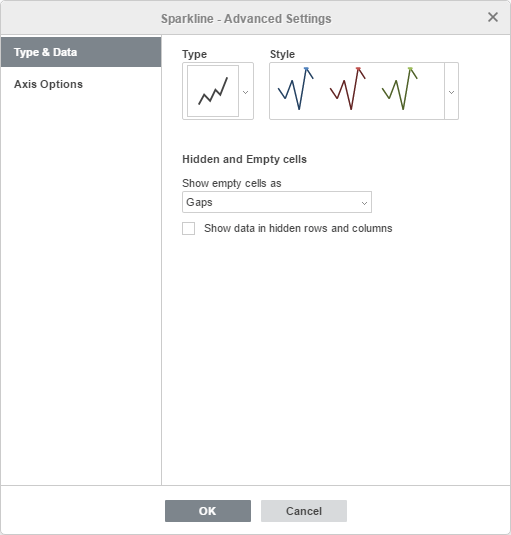
The Type & Data tab allows you to change the sparkline Type and Style as well as specify the Hidden and Empty cells display settings:
-
Show empty cells as: this option allows you to control how sparklines are displayed if some cells in a data range are empty. Select the necessary option from the list:
-
Gaps: to display the sparkline with gaps in place of missing data,
-
Zero: to display the sparkline as if the value in an empty cell was zero,
-
Connect data points with line (available for the Line type only) - to ignore empty cells and display a connecting line between data points.
-
-
Show data in hidden rows and columns: check this box if you want to include values from the hidden cells into sparklines.
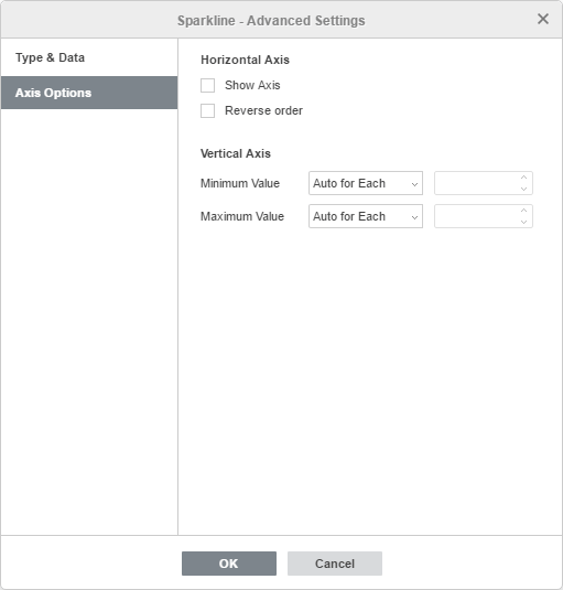
The Axis Options tab allows you to specify the following Horizontal/Vertical Axis parameters:
-
In the Horizontal Axis section, the following parameters are available:
-
Show axis: check this box to display the horizontal axis. If the source data contain negative values, this option helps to display them more vividly.
-
Reverse order: check this box to display data in the reverse sequence.
-
-
In the Vertical Axis section, the following parameters are available:
-
Minimum/Maximum Value
-
Auto for Each: this option is selected by default. It allows you to use own minimum/maximum values for each sparkline. The minimum/maximum values are taken from the separate data series that are used to plot each sparkline. The maximum value for each sparkline will be located at the top of the cell, and the minimum value will be at the bottom.
-
Same for All: this option allows you to use the same minimum/maximum value for the entire sparkline group. The minimum/maximum values are taken from the whole data range that is used to plot the sparkline group. The maximum/minimum values for each sparkline will be scaled relative to the highest/lowest value within the range. If you select this option, it will be easier to compare several sparklines.
-
Fixed: this option allows you to set a custom minimum/maximum value. The values which are lower or higher than the specified ones are not displayed in the sparklines.
-
-

